Some Essential PPC Landing Page Optimization Tips

Most people consider that their website’s homepage is a means to make a strong and lasting first impression. They are wrong. The landing pages and not the homepage of the website help you create the first impression. Landing pages are your key to increased conversions. Without the right investment in optimization of landing pages, you will easily lose both precious money as well as time.
Optimizing your landing page will help you get better conversions as well as make a lasting first impression. Studies show that 61% of the companies on the internet run less than 6 landing pages every month. They fail to utilize the full potential of aesthetically appealing landing page designs.
So, if you wish to make the most out of your landing pages, here are 10 easy-to-implement tips that can help you today.
-
Use A/B Testing
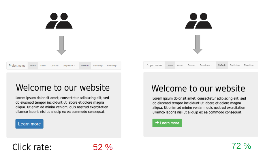
Most people fail to test their campaigns before launching them at a massive scale. It is important that you understand the importance of testing the campaign beforehand. With the right A/B testing methods, you can easily select the most effective campaign in a controlled environment. You can also carry out a focus group testing within the organization to look for the scope of improvement in the landing page design.

Basically, by increasing the number of viewers in a controlled environment you are predicting the success/failure of the landing page design.
-
Create a Target Funnel
Why are you creating the landing pages in the first place? To get the customer details. Remember! Landing pages are not meant to finalize the sale. They are just meant to attract the customer and redirect them to the real product/service page.
Landing pages are more like click-baits. If you can generate the interest in the target audience, you can easily close the sales at a later stage during the sales cycle. You need to understand that in the world of digital marketing there is no concept of one-size-fits-all. Instead, you need to focus only on your target audience and design a campaign accordingly to avail desirable results.
-
Create Engaging Content
This one is a no-brainer. If you can create engaging content, you have already won half the battle. By creating such content, you can easily pique the interest of the customer for the right product at the right time. Flash sales are a great example of showcasing urgency and creating good content. Several people participating in the flash sale of a product do not actually need the product in the first place. They just participate and end up buying the product/service due to peer pressure.

-
Focus on Videos/Pictorial Content
Textual content cannot fetch you the necessary amount of views in today’s digital landscape. You need to think creatively and post video/picture content to capture the attention of the users. Most of the population will prefer reading concise paragraphs, lists or bullet points instead of a long essay.
Focusing on informative content is always better than focusing on the promotional aspect of it. When you provide true value to the audience, they will end up purchasing your services/products more often.
-
Improve UX
The user experience plays a major role in the landing page optimization project. A good UX feels natural and one can navigate easily on the interface without the need for a tutorial. The landing pages for your website will catch the attention of the visitor only for a few seconds. After this, the visitor will click away immediately if he/she isn’t able to look for a particular button. By making clear and large signals/buttons, you can make sure that the visitor faces no trouble in navigation.

-
Have a Powerful CTA
Establishing a powerful Call-To-Action line is where most marketers go wrong. Without the right CTA, the visitor will get the necessary information on the landing page and click away. On the other hand, with the right CTA, you will successfully secure the contact details of the visitor. While drafting the informative content make sure that you do not get carried away in providing value to the customers. Instead, add a hint of promotional content too so that you have an easier time converting the prospect into a customer. The CTA can ask the visitor to do one of the following things:
- Click on aButton
- Provide Contact Details
- Buy a Product/Service
-
Write Testimonials
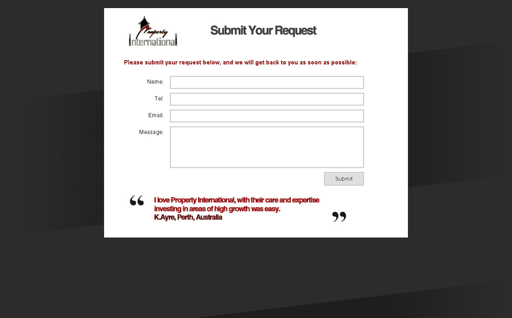
Adding a face to the landing page design will increase the chances of its success by a significant amount. By adding a trustworthy face and a testimonial you enable your audience to put themselves into the shoes of your customers and think. Make sure that you add a reliable and true testimonial. A fake testimonial can ruin your online reputation almost immediately.
-
Design SEO-Friendly Pages
Ideally, you should couple your landing page optimization efforts with SEO to get the best results out of the campaign. SEO-friendly landing pages will see a high click rate compared to the non-optimized pages. The search engine will put your landing page and ads on a higher rank if you can design an SEO-optimized page.
-
Keep a Neat Interface
While dealing with landing pages, you have a very small amount of space to experiment with. With the right distribution of the content, you can fit the most important aspects of it in the limited space. Make sure that you do not make the content look too crowded.

-
Install a Funny USP
A normal internet user will see hundreds of landing pages and ads every day. So how do you make your ad stand out? Simple. You make it memorable by adding a hint of humour to it. By showcasing your USP and adding a humorous element, you can ensure that the audience remembers your landing page every time a similarly themed design pops up.
Follow these 10 tips to plug the holes in the leaky landing page design campaigns. By following these critical tips you will easily beat your competitors and see increased conversion rates from day one.

